Seattle Fire Response
Written on February 26th, 2023 by Brandon Kerns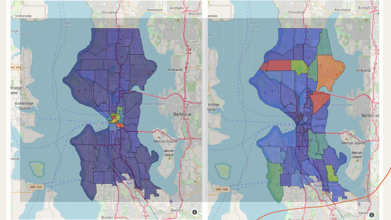
Seattle Fire Department Calls and Response
import numpy as np
import pandas as pd
import geopandas as gpd
import plotly.express as px
import datetime as dt
import colorcet as ccet
import matplotlib.pyplot as plt
import plotly.io as pio
# This ensures Plotly output works in multiple places:
# plotly_mimetype: VS Code notebook UI
# notebook: "Jupyter: Export to HTML" command in VS Code
# See https://plotly.com/python/renderers/#multiple-renderers
pio.renderers.default = "plotly_mimetype+notebook"
df = pd.read_csv('../data/Call_Data.csv', parse_dates=['Original Time Queued','Arrived Time'])
df['Hour Of Day Queued'] = [x.hour for x in df['Original Time Queued']]
df.head()
| CAD Event Number | Event Clearance Description | Call Type | Priority | Initial Call Type | Final Call Type | Original Time Queued | Arrived Time | Precinct | Sector | Beat | Hour Of Day Queued | |
|---|---|---|---|---|---|---|---|---|---|---|---|---|
| 0 | 2022000018060 | ASSISTANCE RENDERED | 911 | 1 | SFD - ASSIST ON FIRE OR MEDIC RESPONSE | --ASSIST OTHER AGENCY - CITY AGENCY | 2022-01-22 13:35:02 | 2022-01-22 13:49:15 | WEST | QUEEN | Q1 | 13 |
| 1 | 2022000012185 | ASSISTANCE RENDERED | 911 | 1 | SFD - ASSIST ON FIRE OR MEDIC RESPONSE | --ASSIST PUBLIC - OTHER (NON-SPECIFIED) | 2022-01-15 15:42:31 | 2022-01-15 15:49:33 | WEST | DAVID | D3 | 15 |
| 2 | 2022000270039 | REPORT WRITTEN (NO ARREST) | 911 | 1 | SFD - ASSIST ON FIRE OR MEDIC RESPONSE | --SUSPICIOUS CIRCUM. - SUSPICIOUS PERSON | 2022-10-08 12:02:20 | 2022-10-08 12:09:22 | WEST | DAVID | D3 | 12 |
| 3 | 2022000270129 | ASSISTANCE RENDERED | 911 | 1 | SFD - ASSIST ON FIRE OR MEDIC RESPONSE | --ASSIST OTHER AGENCY - CITY AGENCY | 2022-10-08 13:52:28 | 2022-10-08 13:55:53 | NORTH | JOHN | J1 | 13 |
| 4 | 2022000012668 | ASSISTANCE RENDERED | 911 | 1 | SFD - ASSIST ON FIRE OR MEDIC RESPONSE | --ASSIST OTHER AGENCY - CITY AGENCY | 2022-01-16 05:54:11 | 2022-01-16 06:01:21 | NORTH | JOHN | J3 | 5 |
What times are busiest?
And does it vary by precinct?
px.histogram(df, x='Hour Of Day Queued', color='Precinct', title='SFD Calls By Time Of Day')
What were response times like throughout the day?
df['Response Time'] = [(df['Arrived Time'][x] - df['Original Time Queued'][x]).seconds for x in range(len(df))]
df.info()
<class 'pandas.core.frame.DataFrame'> RangeIndex: 2086 entries, 0 to 2085 Data columns (total 13 columns): # Column Non-Null Count Dtype --- ------ -------------- ----- 0 CAD Event Number 2086 non-null int64 1 Event Clearance Description 2086 non-null object 2 Call Type 2086 non-null int64 3 Priority 2086 non-null int64 4 Initial Call Type 2086 non-null object 5 Final Call Type 2086 non-null object 6 Original Time Queued 2086 non-null datetime64[ns] 7 Arrived Time 1777 non-null datetime64[ns] 8 Precinct 2086 non-null object 9 Sector 2086 non-null object 10 Beat 2086 non-null object 11 Hour Of Day Queued 2086 non-null int64 12 Response Time 1777 non-null float64 dtypes: datetime64[ns](2), float64(1), int64(4), object(6) memory usage: 212.0+ KB
px.histogram(df, x='Response Time', range_x=[0,1200],nbins=1000, labels={'Response Time':'Response Time [seconds]'})
px.density_heatmap(df, x='Hour Of Day Queued', y='Response Time', range_y=[0, 1200], nbinsy=500, nbinsx=24)
Map Visualizations
How did the volume of calls and response time vary by beat?
import pyproj
gdf = gpd.read_file('../data/SPD_Beats_WGS84.zip')
gdf = gdf.set_index('beat')
Add column for call count for each beat.
## Count the number of calls.
gdf['Call Count'] = [len(df[df['Beat'] == x]) for x in gdf.index]
gdf['Call Count'][gdf['Call Count'] == 0] = np.nan
## Numner of calls per unit area.
gdf['Calls Per Area'] = gdf['Call Count'] / (gdf['st_area_sh']/1e6)
gdf.head()
<ipython-input-25-935fc72e1155>:3: SettingWithCopyWarning: A value is trying to be set on a copy of a slice from a DataFrame See the caveats in the documentation: https://pandas.pydata.org/pandas-docs/stable/user_guide/indexing.html#returning-a-view-versus-a-copy
| objectid | first_prec | sector | st_area_sh | st_length_ | geometry | Call Count | Calls Per Area | |
|---|---|---|---|---|---|---|---|---|
| beat | ||||||||
| 99 | 1 | None | 99 | 2.087731e+08 | 280794.869698 | MULTIPOLYGON (((-122.38226 47.74885, -122.3771... | NaN | NaN |
| B1 | 2 | N | B | 3.888917e+07 | 30766.975027 | POLYGON ((-122.40540 47.67583, -122.40536 47.6... | 70.0 | 1.799987 |
| B2 | 3 | N | B | 5.514478e+07 | 32647.183464 | POLYGON ((-122.36621 47.67599, -122.36606 47.6... | 43.0 | 0.779766 |
| B3 | 4 | N | B | 5.961233e+07 | 36973.284197 | POLYGON ((-122.33801 47.66869, -122.33639 47.6... | 32.0 | 0.536802 |
| C1 | 5 | E | C | 3.255283e+07 | 37950.240898 | POLYGON ((-122.31279 47.61416, -122.31279 47.6... | 32.0 | 0.983018 |
Add column for average response time by beat.
gdf['Average Response Time'] = [np.nanmean(df[df['Beat'] == x]['Response Time']) for x in gdf.index]
gdf.head()
<ipython-input-26-0ca7dfc0965a>:1: RuntimeWarning: Mean of empty slice
| objectid | first_prec | sector | st_area_sh | st_length_ | geometry | Call Count | Calls Per Area | Average Response Time | |
|---|---|---|---|---|---|---|---|---|---|
| beat | |||||||||
| 99 | 1 | None | 99 | 2.087731e+08 | 280794.869698 | MULTIPOLYGON (((-122.38226 47.74885, -122.3771... | NaN | NaN | NaN |
| B1 | 2 | N | B | 3.888917e+07 | 30766.975027 | POLYGON ((-122.40540 47.67583, -122.40536 47.6... | 70.0 | 1.799987 | 698.530612 |
| B2 | 3 | N | B | 5.514478e+07 | 32647.183464 | POLYGON ((-122.36621 47.67599, -122.36606 47.6... | 43.0 | 0.779766 | 667.450000 |
| B3 | 4 | N | B | 5.961233e+07 | 36973.284197 | POLYGON ((-122.33801 47.66869, -122.33639 47.6... | 32.0 | 0.536802 | 602.666667 |
| C1 | 5 | E | C | 3.255283e+07 | 37950.240898 | POLYGON ((-122.31279 47.61416, -122.31279 47.6... | 32.0 | 0.983018 | 336.103448 |
Quick Map View
The explore function of Geodataframe can be used to quickly see the geographical features and data values associated with each feature. Mouse over a beat, and a window will popup showing the data for the beat.
Feel free to zoom into see more detailes, especially in the downtown Seattle area.
NOTE: in the gdf.explore() section below, you may see a blank panel with an error message about the notebook not being trusted. I addressed this by doing jupyter trust seattle_fire_response.ipynb on the command line in a terminal window.
gdf.explore()
The plot() function of Geodataframe is useful to make quick plots of the data columns.
fig = plt.figure(figsize=[8,4])
ax1 = fig.add_subplot(1,4,1)
gdf.plot(column='st_area_sh', ax=ax1)
ax2 = fig.add_subplot(1,4,2)
gdf.plot(column='Call Count', ax=ax2)
ax3 = fig.add_subplot(1,4,3)
gdf.plot(column='Calls Per Area', ax=ax3)
ax4 = fig.add_subplot(1,4,4)
gdf.plot(column='Average Response Time', ax=ax4)
ax1.set_title('Area of Beat')
ax2.set_title('Call Count')
ax3.set_title('Calls Per Area')
ax4.set_title('Average Response Time')
Text(0.5, 1.0, 'Average Response Time')

Interactive Maps
Plotly can be used to generate interactive visualizations of the data by beat, using just a few lines of code!
For urban areas, I prefer to use the choropleth_mapbox() function. For example, if you zoom in, you can see where the beats's boundaries correspond to specific highways and streets. If you're looking at a larger spatial scale, such as states, countries, or global, consider using a simpler map background using the choropleth() function instead.
cols = ccet.rainbow4
fig2 = px.choropleth_mapbox(gdf, width=800, height=800, geojson=gdf.geometry, locations=gdf.index, color='Call Count', opacity=0.5,
color_continuous_scale=cols, mapbox_style='open-street-map', center={'lat':47.62,'lon':-122.35}, zoom=10)
fig2.show()
cols = ccet.rainbow4
fig3 = px.choropleth_mapbox(gdf, width=800, height=800, geojson=gdf.geometry, locations=gdf.index, color='Calls Per Area', opacity=0.5,
color_continuous_scale=cols, mapbox_style='open-street-map', center={'lat':47.62,'lon':-122.35}, zoom=10)
fig3.show()
cols = ccet.rainbow4
fig4 = px.choropleth_mapbox(gdf, width=800, height=800, geojson=gdf.geometry, locations=gdf.index, color='Average Response Time', opacity=0.5,
color_continuous_scale=cols, mapbox_style='open-street-map', center={'lat':47.62,'lon':-122.35}, zoom=10)
fig4.show()